· Ahmed Chaabni · Vaadin · 8 min read
Mastering Vaadin 25 with Tailwind CSS
A Modern Approach to Web Application Styling
- 1What’s New in Vaadin 25 Styling
- 2Simplified Theming Model
- 3What About Material Theme?
- 4Tailwind CSS Integration: Getting Started
- 5Why Tailwind?
- 6Enabling Tailwind in Your Project
- 7Important: Tailwind and Vaadin Components Have Different Roles
- 8Example: Combining Tailwind and Vaadin Components
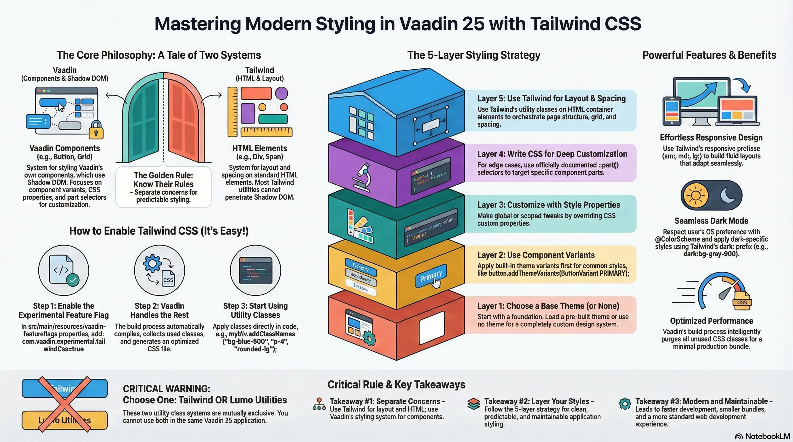
- 9Styling Strategy: Layered Approach
- 10Layer 1: Choose a Theme (or None)
- 11Layer 2: Use Component Variants
- 12Layer 3: Customize with Style Properties
- 13Layer 4: CSS Blocks for Edge Cases
- 14Layer 5: Tailwind for HTML Layouts
- 15Practical Example: Building a Dashboard Layout
- 16Tailwind or Lumo Utility Classes Not Both!
- 17Performance Considerations
- 18Responsive Design with Tailwind
- 19Dark Mode Support
- 20Migration Path from Vaadin 24
- 21Conclusion
- 22Source Code
Vaadin 25 marks a significant milestone in the framework’s evolution, bringing a fresh philosophy to application development: treat styling like a standard modern web stack, not a framework special case. One of the most exciting additions is experimental Tailwind CSS integration, which allows developers to leverage the power of utility-first CSS alongside Vaadin’s robust component library.
In this guide, we’ll explore how to effectively use Tailwind CSS with Vaadin 25, what makes this integration special, and best practices for building beautiful, maintainable applications.
At the end of this guide, you’ll find a reference to a project you can clone [1] . You can even run it right now using Docker:
docker run -p 9000:8080 achaabni/vaadin-tailwind-landing:latestOnce running, access it at http://localhost:9000.
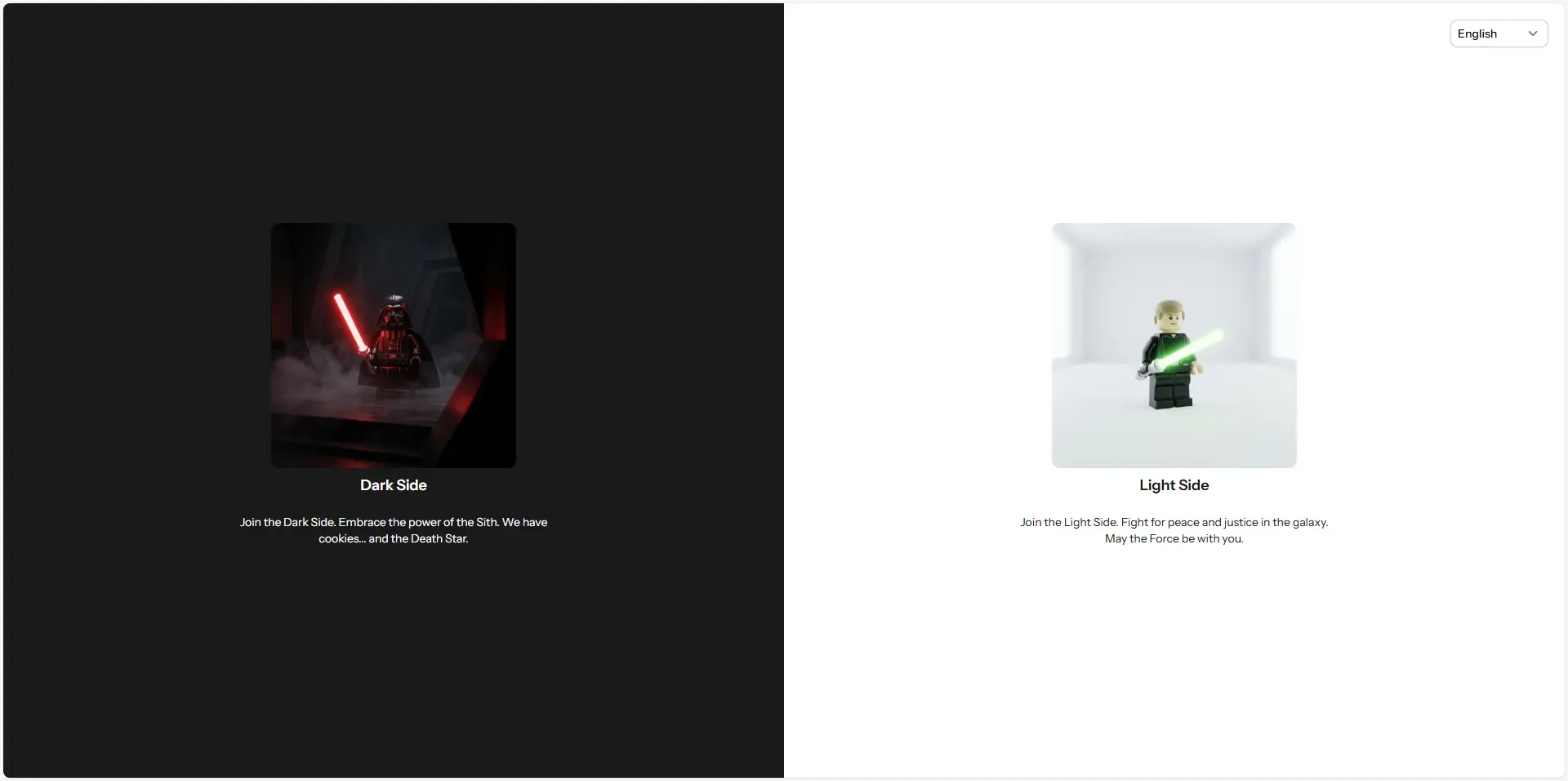
Before we continue, let’s take a look at a video summary of a project anonymized and migrated to Vaadin 25 with Tailwind CSS integration.
What’s New in Vaadin 25 Styling
Simplified Theming Model
Vaadin 25 fundamentally rethinks how applications are styled. The framework now treats themes as plain CSS stylesheets rather than framework-specific configuration, reducing boilerplate and making development feel more like standard web development.
Key improvements include:
- Themes are just stylesheets: No more special theme folders or cryptic configuration files. Drop a stylesheet in
src/main/resources/META-INF/resourcesand load it with@StyleSheetannotations. - Dynamic theme switching: Because themes are stylesheets, you can unload and load them at runtime perfect for light/dark mode toggling, per-user preferences, or multi-tenant branding.
- New Aura theme: A modern, contemporary alternative to Lumo, built on improved base component styles.
- Stronger base styles: Vaadin components now ship with proper “unthemed” base styles using
--vaadin-*CSS custom properties, making it easier to build custom design systems without starting from scratch.
What About Material Theme?
The Material theme has been removed in Vaadin 25. If you’re upgrading from an earlier version, you’ll need to migrate to either Aura, Lumo, or create a custom theme.
Tailwind CSS Integration: Getting Started
Why Tailwind?
Tailwind CSS brings several advantages to Vaadin development:
- Utility-first workflow: Rapidly prototype and iterate on layouts and spacing without writing custom CSS.
- Small production bundle: Tailwind’s intelligent purging means only the classes you use are included in production.
- Consistent design tokens: Built-in responsive breakpoints, color palettes, and spacing scales ensure visual consistency.
- Native Vaadin support: Vaadin 25 has first-class support, so you don’t need workarounds or custom webpack configurations.
Enabling Tailwind in Your Project
Tailwind CSS support in Vaadin 25 is experimental, but straightforward to enable:
Step 1: Enable the Feature Flag
Create or edit src/main/resources/vaadin-featureflags.properties and add:
com.vaadin.experimental.tailwindCss=trueThat’s it! Vaadin’s build process automatically:
- Feeds your source files through the Tailwind compiler
- Collects all Tailwind class names you use
- Generates a static stylesheet with only the CSS you need
- Optimizes the bundle for production
Step 2: Use Tailwind Classes
Start applying Tailwind utility classes to HTML elements in your views:
var warningBox = new Div("Warning!");warningBox.addClassNames("bg-orange-400", "p-6", "rounded-lg", "text-white");Or in React/TypeScript views:
<div className="bg-orange-400 p-6 rounded-lg text-white">Warning!</div>Important: Tailwind and Vaadin Components Have Different Roles
Here’s a critical distinction: Tailwind works best with HTML elements, not Vaadin components.
Vaadin components (Button, TextField, Grid, Dialog, etc.) have complex, nested HTML structures with shadow DOM. Most Tailwind utilities which target standard HTML won’t penetrate the shadow DOM boundary or may only affect the light DOM portions.
Best practice: Use Tailwind for layout and spacing with native HTML elements (<div>, <span>, etc.), and use Vaadin components for feature-rich interactions. For styling Vaadin components themselves, use:
- Style properties: CSS custom properties like
--vaadin-button-background - Component variants: Built-in theme variants like
ButtonVariant.AURA_PRIMARY - Documented selectors: When customization APIs aren’t sufficient, use the documented
::part()selectors
Example: Combining Tailwind and Vaadin Components
// Layout with Tailwindvar container = new Div();container.addClassNames("flex", "gap-4", "p-8", "bg-gray-50");
// Vaadin component with its own stylingvar button = new Button("Submit");button.addThemeVariants(ButtonVariant.AURA_PRIMARY);
// Another HTML element with Tailwindvar spacer = new Div();spacer.addClassNames("flex-1"); // Takes remaining space
container.add(button, spacer);
Styling Strategy: Layered Approach
Vaadin 25 recommends a layered styling approach that works beautifully with Tailwind:
Layer 1: Choose a Theme (or None)
@StyleSheet(Aura.STYLESHEET) // Modern look// or: @StyleSheet(Lumo.STYLESHEET) // Classic Vaadin// or: neither, for minimal base styles@StyleSheet("styles.css")public class Application implements AppShellConfigurator { // ...}If using Aura or Lumo, you get themed components out of the box. If not, components render with minimal styles, ready for customization.
Layer 2: Use Component Variants
Most Vaadin components provide theme variants for common use cases:
Button primary = new Button("Save");primary.addThemeVariants(ButtonVariant.AURA_PRIMARY);
Button secondary = new Button("Cancel");secondary.addThemeVariants(ButtonVariant.AURA_SECONDARY);
Layer 3: Customize with Style Properties
Override theme colors and sizes globally or scoped:
/* Global overrides */html {  --aura-primary-color: #007bff;  --aura-font-family: 'Segoe UI', sans-serif;}
/* Scoped to specific components */vaadin-button.important {  --aura-primary-color: #ff0000;}
Layer 4: CSS Blocks for Edge Cases
Only when the above approaches don’t suffice, write custom CSS using documented selectors:
vaadin-grid::part(header-cell) { font-weight: bold; background-color: var(--aura-contrast-5pct);}Layer 5: Tailwind for HTML Layouts
Use Tailwind to orchestrate layouts, spacing, and responsive behavior:
var layout = new Div();layout.addClassNames( "grid", "grid-cols-1", "md:grid-cols-3", // Responsive: 1 column on mobile, 3 on desktop "gap-6", "p-8");Practical Example: Building a Dashboard Layout
Here’s a complete example combining all techniques:
@StyleSheet(Aura.STYLESHEET)@StyleSheet("dashboard.css")@Route("dashboard")public class DashboardView extends VerticalLayout implements BeforeEnterObserver {
    public DashboardView() {        addClassNames("h-screen", "flex", "flex-col");
        // Header        var header = createHeader();        header.addClassNames("bg-blue-600", "text-white", "p-6");
        // Main content area        var mainContent = new HorizontalLayout();        mainContent.addClassNames("flex-1", "gap-4", "p-6");
        // Sidebar        var sidebar = createSidebar();        sidebar.addClassNames("w-64", "bg-gray-100", "p-4");
        // Content panel        var contentPanel = new Div();        contentPanel.addClassNames("flex-1", "bg-white", "rounded-lg", "shadow");        contentPanel.add(new H2("Dashboard Content"));
        mainContent.add(sidebar, contentPanel);        add(header, mainContent);    }
    private Component createHeader() {        var header = new HorizontalLayout();        header.setWidthFull();        header.setJustifyContentMode(JustifyContentMode.BETWEEN);
        var title = new H1("My Dashboard");        title.addClassNames("m-0", "text-2xl");
        var logout = new Button("Logout");        logout.addThemeVariants(ButtonVariant.AURA_TERTIARY);
        header.add(title, logout);        return header;    }
    private Component createSidebar() {        var sidebar = new VerticalLayout();        sidebar.setSpacing(false);        sidebar.setPadding(false);
        var nav1 = new Button("Home");        nav1.addThemeVariants(ButtonVariant.AURA_TERTIARY);        nav1.setWidthFull();
        var nav2 = new Button("Reports");        nav2.addThemeVariants(ButtonVariant.AURA_TERTIARY);        nav2.setWidthFull();
        sidebar.add(nav1, nav2);        return sidebar;    }}
And the accompanying CSS (dashboard.css):
/* Dashboard-specific styles using custom CSS when needed */vaadin-button[theme~="tertiary"] {    --aura-text-color: var(--aura-contrast-70pct);    text-align: left;    padding: var(--lumo-space-m);}
vaadin-button[theme~="tertiary"]:hover {    --aura-background-color: var(--aura-contrast-10pct);}
Tailwind or Lumo Utility Classes Not Both!
A critical constraint: Tailwind CSS and Lumo Utility Classes are mutually exclusive. You cannot use both in the same application.
- If you enable Tailwind, don’t load Lumo Utility Classes
- If you prefer Lumo’s utility classes, don’t enable Tailwind
Choose based on your team’s preference and existing ecosystem familiarity.
Performance Considerations
Vaadin 25’s Tailwind integration is optimized for production:
- Intelligent purging: The Vaadin build process only includes Tailwind CSS for classes actually used in your source files
- Minimal bundle impact: Unlike generic Tailwind setups, you only pay for what you use
- Development experience: Hot-reload in dev mode means you see changes instantly
- Production bundles: Smaller than Vaadin 24, with ~30% fewer transitive dependencies overall
Responsive Design with Tailwind
Tailwind’s responsive prefixes work seamlessly with Vaadin:
var grid = new Div();grid.addClassNames(    "grid",    "grid-cols-1",      // 1 column on mobile    "sm:grid-cols-2",   // 2 columns on small screens    "lg:grid-cols-4",   // 4 columns on large screens    "gap-4");
for (int i = 0; i < 12; i++) {    var card = new Div(new H3("Card " + (i + 1)));    card.addClassNames("bg-white", "rounded-lg", "shadow", "p-4");    grid.add(card);}
Dark Mode Support
Vaadin 25 makes dark mode natural:
@ColorScheme(ColorScheme.Value.LIGHT_DARK) // Respects OS/browser setting@StyleSheet(Aura.STYLESHEET)public class Application implements AppShellConfigurator {}For Tailwind, you can use dark mode selectors:
var card = new Div("Content");card.addClassNames("bg-white", "dark:bg-gray-900", "text-black", "dark:text-white");And enable dark mode dynamically:
UI.getCurrentOrThrow().getPage().setColorScheme(ColorScheme.Value.DARK);Migration Path from Vaadin 24
If upgrading from Vaadin 24:
- Update dependencies: Vaadin 25 requires Java 21+ and Spring Boot 4 (if using Spring)
- Choose a theme: No default theme is applied automatically. Explicitly load Aura, Lumo, or neither
- Migrate @Theme to @StyleSheet: Replace the old theme folder approach with direct stylesheet loading
- Enable Tailwind (optional): Add the feature flag if you want to use Tailwind
- Update custom styles: If you have shadow DOM styles, migrate to documented selectors
Conclusion
Vaadin 25 with Tailwind CSS represents the framework’s commitment to modern web standards: less framework magic, more standard web development. By understanding the complementary roles of Tailwind (HTML layout and spacing) and Vaadin components (interactive features), you can build applications that are both beautiful and maintainable.
The experimental status of Tailwind integration shouldn’t discourage adoption it’s stable and production-ready. As the Vaadin team gathers feedback, future releases may bring even tighter integration.
Key Takeaways:
- Enable Tailwind with one line:
com.vaadin.experimental.tailwindCss=true - Use Tailwind for layouts and HTML elements; use Vaadin styling (variants, properties, selectors) for components
- Layer your styling: theme → variants → properties → CSS blocks → Tailwind utilities
- Leverage responsive prefixes and dark mode for modern UX
- Enjoy smaller bundles and faster development cycles
Happy styling! 🎨
Source Code
Interested in seeing a landing page minimal implementation? You can find the source code for the landing page project on GitHub:
Ready to Modernize Your Vaadin Apps?
Need help migrating to Vaadin 25 or implementing this new Tailwind-powered architecture? Our experts can guide your team through the transition and build stunning, modern UIs.
Made with ❤️ by the Gladtek Team.